Comment utiliser les modèles Webflow

Vous voulez créer un site Web rapidement sans repartir de zéro ? Flux Web les modèles sont des mises en page de sites Web préconçues et personnalisables qui vous permettent d'économiser du temps, des efforts et de l'argent. Voici un bref résumé de ce que vous devez savoir :
Comparaison rapide :
Fonctionnalité
Payant models
Personnalisation
Limité
Extensif
Caractéristiques
Basique
Avancée
soutien
Minimum ou aucune
Support dédié
Reférencement tools
Peru ou pas
Complet
Speed Optimization
Peut être plus prêté
Hautement optimisé
Cost
0$
49 à 129 dollars
Les modèles Webflow vous permettent de créer rapidement un site Web professionnel et soigné, même si vous n'êtes pas un expert en design. Prêt à démarrer ? Choisissez un modèle, personnalisez-le et lancez votre site dès aujourd'hui.
Comment utiliser Flux Web Models (step by step)
Choisissez le meilleur modèle pour votre travail
Choisir le bon modèle est essentiel pour créer un bon site Web. Comme il existe de nombreux choix, le fait de savoir ce dont vous avez besoin en premier permet de gagner du temps et de vous assurer que le design répond à vos objectifs.
Savoir ce dont votre site Web a besoin
Avant d'examiner les modèles, lister les pièces indispensables de votre site. Cela vous évite de choisir des modèles qui ne correspondent pas à vos besoins.
Tout d'abord, décidez de ce que fera votre site Web. Est-ce pour vendre des objets, présenter votre travail ou obtenir des prospects ? Chaque type a des besoins différents, comme des chariots pour vendre, des galeries pour exposer des œuvres ou des formulaires pour obtenir des prospects.
Think also to your public. Par exemple, une marque de produits de santé peut utiliser des couleurs douces et calmes et des éléments tels que des témoignages pour gagner la confiance. Un éditeur de logiciels peut souhaiter un look épuré et à jour avec des tableaux de tarification et des espaces pour montrer ce que fait le logiciel.
Planifiez à l'avance également. Si vous souhaitez ajouter un blog ou développer votre site ultérieurement, choisissez un modèle qui vous permet d'ajouter des systèmes de contenu dès maintenant. Cela vous évite d'avoir à tout changer plus tard.
Avec des besoins clairs, vous pouvez examiner de près ce que propose chaque modèle.
Model Features Verification
Une fois vos besoins définis, consultez les détails des différents modèles. Utiliser les outils de visualisation, comme la « prévisualisation dans Designer » sur Webflow Marketplace, pour découvrir comment les modèles fonctionnent avec vos contenus.
Trouvez des modèles avec des parties soignées et des noms clairs. Cela facilite les modifications, même si vous n'êtes pas doué pour le codage. Assurez-vous également qu'ils fonctionnent correctement sur tous les appareils : vérifiez si le texte, les images et les mises en page sont beaux et fonctionnent correctement sur les téléphones et les ordinateurs. Une mauvaise vue sur mobile peut nuire à la façon dont les internautes interagissent avec votre site et même à votre classement dans les recherches.
Certains modèles sont conçus pour certains types de travaux. Par exemple :
N'oubliez pas les technologies comme le référencement et sa rapidité de fonctionnement. Les modèles dotés d'une bonne vitesse de page, d'un chargement différé et de versions prêtes pour le référencement peuvent vraiment améliorer le classement de recherche de votre site et la façon dont les internautes l'utilisent.
Enfin, pensez au coût et à ce que vous êtes autorisé à faire avec le modèle.
Free Models and Payants
Le choix entre des modèles gratuits et payants dépend de votre argent et de la taille de votre projet. Les modèles gratuits fonctionnent bien pour un usage personnel, pour tester des idées ou des prototypes, mais ils ne peuvent pas avoir le vernis ou les pièces nécessaires à un travail professionnel.
Les modèles payants, souvent de 49$ à 129$, ont un meilleur design, plus de fonctionnalités et de l'aide lorsque vous en avez besoin. En voici un aperçu :
Partie
Designs gratuits
Designs à coût élevé
Changez-le
Peu de choix
De nombreuses façons de changer
Utils
Simplical Works
Plus d'outils et de mélanges
Aide
Peu ou pas d'aide
De l'aide rien que pour vous
New content
Pas souvent
Souvent des nouveautés
À utiliser pour le travail
Souvent, je ne peux pas
Peut tout utiliser pour le travail
Reférencement tools
Peru ou pas
Outils d'aide à la recherche
À quelle vitesse ça marche
Peut être prêté
Rapide et fonctionne bien
Les meilleurs modèles contiennent souvent de l'aide et des guides, qui peuvent vous sauver la vie si vous rencontrez des problèmes pour apporter des modifications. Ils reçoivent également régulièrement de nouveaux correctifs de sécurité et fonctionnent bien avec des outils et des fonctionnalités supplémentaires.
Pour les tâches professionnelles, modèles haut de gamme you can to edit more details. Vous pouvez modifier son apparence et son fonctionnement pour qu'il corresponde parfaitement à votre marque. De plus, ils vous permettent souvent de les utiliser pour gagner de l'argent, ce qui est essentiel si votre site rapporte de l'argent. L'achat d'un modèle haut de gamme peut vous éviter des problèmes juridiques et vous assurer que votre site obtient de bonnes notes.
Personnalisez votre modèle de flux Web
Lorsque vous choisissez un Webflow Model qui correspond à votre projet, il est temps de le peaufiner. La modification du design, des mots et des éléments technologiques de pointe garantit que votre site affiche le style de votre marque. Webflow vous facilite la tâche en affichant les modifications au fur et à mesure qu'elles se produisent.
Personnalisez votre design
Commencez par ajouter les couleurs de votre marque avec Mondiaux Samples, un outil intelligent qui vous permet de changer les couleurs de l'ensemble de votre site en une seule fois. Accédez au panneau Style, insérez vos couleurs dans Global Swatches et utilisez l'outil pipette pour sélectionner les couleurs de votre logo ou d'autres éléments clés de votre marque.
Les modèles Webflow disposent généralement d'un guide de style intégré, qui constitue un point de départ pour modifier des éléments de conception de haut niveau. Les modifications que vous apportez au guide de style s'étendent à l'ensemble de votre site, ce qui vous permet de gagner du temps et de garder les choses inchangées.
Le panneau Style vous permet également d'affiner la mise en page, l'espace, les polices et les arrière-plans. Avec les classes, vous pouvez enregistrer et réutiliser les informations de conception, ce qui rend votre conception fluide. Et vérifiez l'accessibilité : le correcteur de contraste de Webflow s'assure que les couleurs de votre texte sont claires par rapport à l'arrière-plan que vous avez choisi.
Lorsque votre design est correct, commencez à modifier les mots pour les adapter à votre nouveau style.
Insérer et gérer les mots
Tout d'abord, remplacez-le texte de l'espace réservé par vos vrais mots. Cela définit la structure et facilite votre référencement. Les mots réels indiquent souvent les modifications de conception dont vous pourriez avoir besoin.
Pour des informations telles que des articles de blog, des informations sur l'équipe ou des listes de produits, Webflow's Collections CMS change beaucoup de choses. Tes collections fonctionnent comme des ensembles de données, mettant à jour les mots sur l'ensemble de votre site de manière autonome. Par exemple, en utilisant le modèle « Calmy » pour une marque de bien-être, vous pouvez créer une collection de services en veillant à ce que chaque page de service ait la même apparence. En outre, Lists of Collections vous permettent d'afficher des informations mises à jour, comme les nouveaux articles de blog, sur des pages qui ne changent pas.
Lorsque vous échangez des photos, choisissez celles qui correspondent à l'apparence de votre marque et aux règles de taille et de style du modèle. Par exemple, si le modèle contient des photos audacieuses et vivantes mais que votre marque est calme, choisissez des photos qui correspondent à votre ambiance apaisante sans perturber la mise en page.
Pour un meilleur référencement, veuillez modifier vos mots au fur et à mesure. Ajoutez un texte alternatif clair aux photos, utilisez les bons titres et créez des URL intelligentes pour le référencement dans le CMS. Les outils de référencement de Webflow permettent également de créer des plans de site, des liens personnalisés et des méta-titres.
Add of Pointe Technologiques Elements
Une fois que votre design et vos mots sont définis, vous pouvez ajouter des éléments technologiques de pointe pour améliorer votre site. Webflow vous permet de visualiser les modifications avant d'ajouter du code personnalisé ou d'autres outils.
« Le code personnalisé est une modification avancée qui peut entrer en conflit avec les fonctionnalités sous-jacentes de Webflow. En tant que tel, Webflow ne peut garantir la fonctionnalité ou la compatibilité totale d'un code personnalisé. » - Webflow
Vous pouvez insérer votre propre code dans votre site Webflow de trois manières principales :
Le Insère un élément est idéal pour ajouter des éléments tels que des formulaires de contact, des informations sur les réseaux sociaux ou des moyens de suivre les visiteurs de votre site, uniquement dans les parties que vous souhaitez. Pour les choses dont vous avez besoin sur l'ensemble du site, comme Google Analytics or de nouvelles politiques, insérez le code dans l'en-tête ou le pied de page des paramètres de votre projet. Pour les outils sur une seule page, comme une calculatrice ou une fonction interactive, accédez aux paramètres de cette page.
Pour que votre site reste rapide, créez un code simple et net. Supprimez le code supplémentaire, réduisez la taille des fichiers et utilisez le chargement différé pour accélérer le chargement des pages. Prenez des notes dans votre code pour qu'il soit facile à comprendre. Enregistrez le code que vous utilisez fréquemment dans un autre fichier afin de pouvoir y accéder rapidement. Lorsque vous ajoutez des outils provenant d'autres utilisateurs, ajoutez-les un par un et vérifiez-les bien pour détecter rapidement tout problème. Cela permet à votre site de fonctionner correctement et rapidement.
sbb-itb-fdf3c56
Rendre votre site rapide et facile à utiliser
Après avoir configuré votre modèle Webflow, l'étape suivante consiste à vous assurer qu'il fonctionne rapidement sur tous les appareils et navigateurs Web. Un site rapide et fluide satisfait les utilisateurs et peut également aider votre site à mieux se classer dans les résultats de recherche. Voici comment ajuster votre modèle pour qu'il soit facile à utiliser et rapide pour tout le monde.
S'assurer qu'il fonctionne sur les téléphones
De nos jours, la majeure partie du trafic Web provient d'appareils mobiles, c'est terminé 54.87 % de toutes les visites aujourd'hui, contre seulement 2,94 % en 2010. Il est donc essentiel de vous assurer que votre site s'affiche bien sur des écrans plus petits.
Webflow utilise un stop point system pour faciliter la conception pour différentes tailles d'écran, sans avoir à le coder. Commencez par concevoir d'abord pour les écrans mobiles, car les téléphones ont moins d'espace d'écran.
Lorsque vous concevez, utilisez unités relatives comme vh, volkswagen, em, et rem plutôt que des pixels fixes. Comme Nick Gard l'a judicieusement dit : « Absolument aucune unité absolue ! ». Ces unités flexibles permettent à votre design de s'adapter parfaitement à tous les appareils.
Pour la navigation sur les téléphones, optez pour la simplicité. Utiliser menus flexibles, des menus déroulants et des icônes faciles à toucher. La configuration de votre contenu est également importante : ce qui s'affiche bien sur un grand écran peut l'être trop sur un téléphone. Concentrez-vous sur les principaux points et utilisez Webflow previsualisation mode pour corriger l'espacement, la taille des polices et l'emplacement des images selon les besoins.
Les images sont également essentielles. Assurez-vous qu'ils sont bien redimensionnés, qu'ils se chargent rapidement et qu'ils comportent un texte alternatif clair pour rendre le site plus accessible.
Accelerar el chargement de votre site
La rapidité de chargement de votre site peut améliorer ou défaire l'expérience de l'utilisateur et générer plus de ventes. Sites qui se chargent 0 to 2 seconds enregistrent les meilleures ventes, et chaque seconde supplémentaire incite davantage d'utilisateurs à partir. En fait, 26 % des utilisateurs partiront si le chargement d'un site prend plus de 5 secondes.
Pour rendre votre site plus rapide, commencez par image optimization. Réduisez les images à l'aide d'outils tels que petit PNG ou Squoosh, passez-les au format WebP si possible et utilisez des SVG pour les icônes.
Allumer chargement différé pour les images en bas de page, afin qu'elles se chargent au fur et à mesure que les utilisateurs font défiler la page, réduisant ainsi les temps de chargement initiaux.
Réduire niveaux de scripts et reportez ceux dont vous n'avez pas vraiment besoin jusqu'à ce que le contenu principal soit disponible.
Les politiques sont également importantes. À utiliser uniquement 2 à 3 épaisseurs de police par page, et pensez à utiliser les polices système déjà présentes sur la plupart des appareils.
Webflow fournit également des outils intégrés pour des vitesses plus rapides, comme Global CDN et automatique Certificats SSL, en veillant à ce que votre site se charge rapidement et en toute sécurité.
« Des performances de site solides sont cruciales et la plateforme sur laquelle vous choisissez de vous appuyer peut faciliter ou compliquer le maintien de ces performances. » — David Bitton, cofondateur et PDG de DoorLoop
Utilisez des outils tels que Informations sur la vitesse de page, GT Metrix, ou Pingdom pour repérer les zones à corriger et assurer la fluidité de votre site.
Vérifiez si cela fonctionne sur tous les navigateurs
Votre modèle Webflow doit fonctionner correctement sur tous les navigateurs et appareils.
Tout d'abord, vérifiez votre code avec des outils tels que Validateur HTML du W3C et Validateur CSS Jigsaw. Un code propre et sans erreur permet de résoudre les problèmes.
UNE Réinitialisation de la feuille de style CSS comme Normalize.css permet de rendre les styles identiques dans les différents navigateurs, en corrigeant les petits problèmes d'affichage liés à la façon dont les choses sont vues.
Si tu peux, testez sur de vrais appareils. Bien que les outils de test de navigateur soient utiles, il est préférable de consulter votre site sur de vrais téléphones, tablettes et ordinateurs. Ils peuvent rencontrer des problèmes avec des formulaires, des éléments en mouvement ou des images qui ne peuvent pas apparaître dans les simulateurs.
Vérifiez les navigateurs connus tels que Chrome, Safari, Firefox et Edge, y compris les versions de leur téléphone.
« Les tests de compatibilité entre navigateurs garantissent que votre site Web a atteint son public cible sans incohérences qui pourraient avoir un impact négatif sur leur expérience. » — L'équipe Webflow
Effectuez ces vérifications dès que vous commencez à modifier votre site. Il est plus simple de corriger les problèmes lorsque votre site est encore basique, au lieu d'attendre qu'il soit plus développé. Si vous utilisez du CSS personnalisé, des outils tels que Bootstrap peut rendre les choses moins compliquées.
Testez souvent. À mesure que les navigateurs Web changent, votre site doit s'adapter. Vérifiez toujours sa rapidité et son bon fonctionnement, principalement après de gros changements ou mises à jour. Cette façon active de gérer permet à votre site de fonctionner correctement et de le rendre facile à utiliser au fil du temps.
Gardez votre modèle à jour
Assurez-vous que votre modèle Webflow reste neuf pour qu'il fonctionne correctement et améliore votre apparence en ligne. Mettez-le à jour régulièrement pour l'adapter à vos objectifs au fur et à mesure que vous modifiez le contenu et ajoutez de nouveaux éléments.
Gérez les versions et créez des copies
Webflow facilite la création de copies en enregistrant le travail toutes les 50 fois qu'il enregistre lui-même, et lorsque vous publiez ou apportez des modifications importantes. Mais pour les grands projets, il ne suffit pas de se fier uniquement à ces copies enregistrées.
Pour assurer la sécurité de votre travail, créez vos propres copies avant les changements importants. Déplacez ces copies vers un autre endroit pour les conserver en toute sécurité et pensez à les utiliser GitHub pour gérer votre code personnalisé. Il est également sage de noter des informations sur les outils externes et les modifications que vous apportez afin de savoir ce que vous avez fait.
Configurez des alertes à l'aide d'outils tels que Agenda Google n'oubliez pas de faire des copies souvent. Pour plus de sécurité, déplacez les données de votre CMS et suivez les modifications. Si votre site change souvent, utilisez la fonction de copie de Webflow pour essayer les modifications à un autre endroit avant de les appliquer sur votre site réel.
Il est tout aussi important de tester vos copies enregistrées que de les créer. Assurez-vous souvent que vos copies enregistrées fonctionnent correctement et contiennent tout, afin d'être prêt à tout problème.
SEO et création de nouveaux contenus
Le démarrage de votre site n'est que le début. Pour continuer à bien figurer dans les classements de recherche, un nouveau contenu adapté est souvent nécessaire.
Utilisez des outils qui suivent l'évolution de votre site pour identifier ce qui doit être amélioré. Renouvelez l'ancien contenu, assurez-vous qu'il comporte de bons en-têtes, méta-titres et images. Simplifiez les URL et utilisez les redirections 301 pour toute modification. Conservez une configuration claire du site en utilisant des balises d'en-tête droites (H1—H6) et des liens vers l'intérieur du site. Pour les méta-titres, limitez-les à 60 lettres et limitez les méta-descriptions à 160 lettres.
Accélérez le chargement des images en réduisant leur taille, en ajoutant du texte alternatif clair et en utilisant de nouveaux formats tels que WebP. Après de grands changements, donnez de nouveaux plans de site à Google Search Console pour aider les moteurs de recherche à trouver le bon contenu.
« Les URL contenant des mots pertinents pour le contenu et la structure de votre site sont plus conviviales pour les visiteurs qui naviguent sur votre site. » - Google
Restez au courant des tendances et des mises à jour en matière de référencement pour vous assurer que votre plan reste solide.
Models improvement
Au fur et à mesure que votre entreprise se développe, il se peut que votre modèle doive également évoluer. Il peut s'agir d'ajouter de nouvelles parties, d'améliorer son fonctionnement ou de donner un nouveau look à votre site. La mise à jour de votre modèle peut vous aider à mieux atteindre vos objectifs.
Vérifiez votre modèle de temps en temps pour vous assurer qu'il peut gérer plus de personnes et de nouvelles fonctionnalités. Avant de procéder à la mise à niveau, examinez les nouveautés de la version et réfléchissez à la manière dont cela pourrait modifier ce que vous avez déjà fait. Notez toutes les choses spéciales, les parties qui fonctionnent ensemble et tout ce qui est unique pour faciliter le passage à la nouvelle version.
Testez toujours les mises à niveau dans une zone de test avant de les mettre sur votre site en ligne. La fonctionnalité de copie du site de Webflow est utile pour cela. Pour maintenir un bon référencement, gardez une trace de votre URL et configurez les redirections 301 nécessaires.
Planifiez des mises à niveau lorsque votre entreprise est moins occupée afin de réduire les problèmes. Établissez un plan pour revenir en arrière si nécessaire et informez votre équipe ou vos utilisateurs de tout changement.
La mise à niveau de votre modèle n'est pas uniquement une question d'apparence, c'est l'occasion de l'améliorer, de le rendre plus rapide et plus agréable pour les utilisateurs. Grâce à une bonne planification, ces mises à niveau peuvent aider votre site à atteindre vos objectifs commerciaux et à continuer à bien fonctionner.
Conclusion et principaux points à retenir
Récapitulatif des avantages
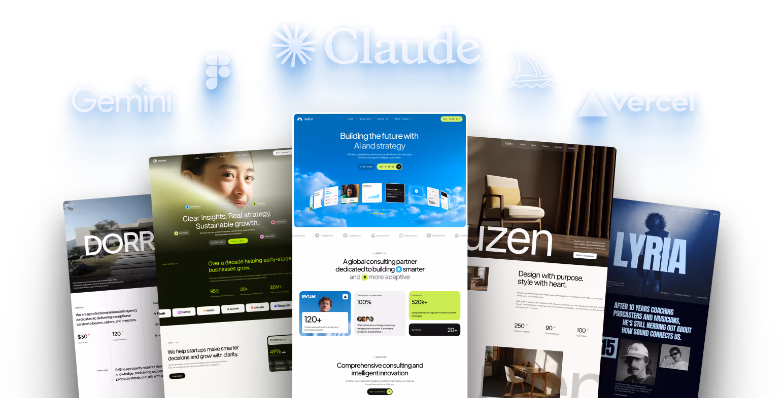
Les modèles Webflow permettent de créer des sites Web professionnels sans partir de zéro. Avec plus de 1 500 modèles adapté à divers secteurs et besoins, vous êtes sûr de trouver celui qui correspond à vos objectifs spécifiques et à votre identité de marque.
L'un des plus grands avantages ? Economies de coûts. Models dont le prix est compris entre 35$ et 125$ proposent des designs de haute qualité qui, autrement, coûteraient des milliers de dollars à développer à partir de zéro. Par exemple, Laura d'un salon de beauté a sauvé 1 000$ à 2 000$ et rasé 2 à 4 semaines de développement en optant pour le Beauteria model au lieu de commander un site personnalisé.
Ces modèles ne permettent pas seulement d'économiser de l'argent, ils offrent des designs professionnels et soignés dès la sortie de la boîte. Même si vous n'êtes pas un expert en design, la réactivité intégrée et personnalisations options assurez-vous que votre site Web est superbe sur n'importe quel appareil.
Le potentiel de personnalisation est impressionnant. Un designer a transformé un Model of a page to 35$ in a website of 9 pages, prouvant à quel point vous pouvez adapter et développer le design original. Cette flexibilité vous permet de créer un site Web sur mesure sans vous sentir enfermé.
« La personnalisation d'un modèle Webflow ne se limite pas à modifier les couleurs et les politiques, il s'agit de créer une présence en ligne unique qui reflète votre marque et engage votre public. » - Flowmance
Prochaines étapes de mise en œuvre
Maintenant que vous en comprenez les avantages, voici comment donner vie à votre site Web.
Commencez par parcourir la vaste bibliothèque de modèles de Webflow pour trouver un design qui correspond au style et aux besoins fonctionnels de votre marque. Au-delà de l'esthétique, réfléchissez à la manière dont la mise en page et les fonctionnalités soutiennent votre contenu et vos objectifs.
Une fois que vous avez choisi un modèle, personnalisez-le avec votre contenu, vos couleurs et votre image de marque pour accélérer le processus de lancement. Commencez par mettre à jour le guide de style, puis plongez dans Webflow Designer pour effectuer des ajustements plus spécifiques, tels que l'ajout de fonctionnalités de commerce électronique, l'intégration d'outils tiers ou même la rédaction de code personnalisé.
Avant de le lancer, testez minutieusement votre site Web. Vérifiez ses performances sur différents navigateurs (tels que Chrome, Firefox, Safari et Edge) et appareils (ordinateurs de bureau, tablettes et smartphones) pour vous assurer que tout fonctionne correctement. Des outils tels que Google PageSpeed Insights peuvent vous aider à affiner les vitesses de chargement.
Après la mise en ligne, configurez des analyses pour surveiller le comportement des visiteurs, recueillir des commentaires et apporter des améliorations au fil du temps. N'oubliez pas d'optimiser vos paramètres de référencement, de mettre à jour régulièrement le contenu et de maintenir votre site à l'aide de sauvegardes et d'un contrôle de version. Avec la bonne approche, votre modèle Webflow peut s'adapter à votre activité et continuer à fournir d'excellents résultats.
FAQs
Dois-je choisir un modèle Webflow gratuit ou payant pour mon projet ?
Le choix entre un modèle Webflow gratuit ou payant dépend de la complexité de votre projet et de vos objectifs. Free models fonctionnent bien pour des projets plus simples ou des sites Web personnels. Ils proposent des designs basiques mais sont dotés d'options de personnalisation limitées. Si vous créez quelque chose de simple, comme un blog personnel ou un portfolio, ils peuvent être tout ce dont vous avez besoin.
D'un autre côté, payants models sont conçus pour répondre à des besoins plus avancés. Ils offrent des mises en page professionnelles, des fonctionnalités améliorées et une plus grande flexibilité, ce qui les rend mieux adaptés aux projets complexes tels que les boutiques de commerce électronique, les plateformes SaaS ou les sites Web professionnels.
Au moment de prendre une décision, pensez à votre budget, aux fonctionnalités dont vous avez besoin et au temps que vous êtes prêt à consacrer à la personnalisation. Les modèles gratuits peuvent vous faire économiser de l'argent au départ, mais les options payantes offrent souvent une meilleure qualité de conception et de meilleures fonctionnalités. Cela peut vous faire gagner du temps et améliorer l'expérience utilisateur, ce qui rend l'investissement rentable.
Comment personnaliser un modèle Webflow pour qu'il corresponde à l'identité de ma marque ?
Pour qu'un modèle Webflow reflète réellement votre marque, commencez par identifier l'objectif de votre site Web et comprendre votre public. Cette clarté guidera les décisions telles que le choix des couleurs, des polices et des images qui correspondent à la personnalité de votre marque. Faites en sorte que les choses soient cohérentes : utilisez les éléments de design spécifiques à votre marque sur chaque page pour créer un look unifié et raffiné.
L'éditeur visuel de Webflow facilite la personnalisation. Des outils tels que le Navigateur et les panneaux de style vous permettent de modifier les mises en page et les éléments de conception en temps réel. Priorisez l'expérience utilisateur en créant un système de navigation intuitif et en organisant votre contenu pour en faciliter la lisibilité. Un site bien structuré et visuellement attrayant non seulement communique efficacement le message de votre marque, mais laisse également une forte impression sur vos visiteurs.
Comment puis-je m'assurer que mon modèle Webflow est esthétique et fonctionne correctement sur tous les appareils et navigateurs ?
Pour vous assurer que votre modèle Webflow fonctionne correctement sur tous les appareils et navigateurs, voici ce que vous devez faire :
Surveillez les performances de votre site en utilisant des outils d'analyse et en recueillant les commentaires des utilisateurs. Cela vous aidera à identifier les domaines à améliorer et à garantir que votre site reste efficace au fil du temps.
Articles connexes
- Comment personnaliser un modèle de site Web : guide étape par étape
- The complete guide of Web flow models
- Webflow Models : the final manual
- Page de destination de 5 modèles Webflow premium
{» @context « : » https://schema.org","@type":"FAQPage","mainEntity":[{"@type":"Question","name":"Should J'ai choisi un modèle Webflow gratuit ou payant pour mon projet ? », « AcceptedAnswer » : {» @type « :"Answer », « text » : » <p>Le choix entre un modèle Webflow gratuit ou payant dépend de la complexité de votre projet et de vos objectifs. <strong>Les modèles gratuits</strong> fonctionnent bien pour des projets plus simples ou des sites Web personnels. Ils proposent des designs basiques mais sont dotés d'options de personnalisation limitées. Si vous créez quelque chose de simple, comme un blog personnel ou un portfolio, ils peuvent être tout ce dont vous avez besoin.</p> <p>D'un autre côté, les <strong>modèles payants</strong> sont conçus pour des besoins plus avancés. Ils offrent des mises en page professionnelles, des fonctionnalités améliorées et une plus grande flexibilité, ce qui les rend mieux adaptés aux projets complexes tels que les boutiques en ligne, les plateformes SaaS ou les sites Web professionnels</p>. <p>Au moment de prendre une décision, pensez à votre budget, aux fonctionnalités dont vous avez besoin et au temps que vous êtes prêt à consacrer à la personnalisation. Les modèles gratuits peuvent vous faire économiser de l'argent au départ, mais les options payantes offrent souvent une meilleure qualité de conception et de meilleures fonctionnalités. Cela peut vous faire gagner du temps et améliorer l'expérience utilisateur, ce qui rend l'investissement rentable</p>. «}}, {» @type « :"Question », « name » :"Comment personnaliser un modèle Webflow pour qu'il corresponde à l'identité de ma marque ? », « AcceptedAnswer » : {» @type « :"Answer », « text » : » <p>Pour qu'un modèle Webflow reflète réellement votre marque, commencez par identifier l'objectif de votre site Web et comprendre votre public. Cette clarté guidera les décisions telles que le choix des couleurs, des polices et des images qui correspondent à la personnalité de votre marque. Veillez à la cohérence : utilisez les éléments de design spécifiques à votre marque sur chaque page pour créer un look unifié et raffiné.</p> L'<p>éditeur visuel de Webflow facilite la personnalisation. Des outils tels que le Navigateur et les panneaux de style vous permettent de modifier les mises en page et les éléments de conception en temps réel. Priorisez l'expérience utilisateur en créant un système de navigation intuitif et en organisant votre contenu pour en faciliter la lisibilité. Un site bien structuré et visuellement attrayant non seulement communique efficacement le message de votre marque, mais laisse également une forte impression sur vos visiteurs.</p> «}}, {» @type « :"Question », « name » :"Comment puis-je m'assurer que mon modèle Webflow est esthétique et fonctionne correctement sur tous les appareils et navigateurs ? », « AcceptedAnswer » : {» @type « :"Answer », « text » : » <p>Pour vous assurer que votre modèle Webflow fonctionne correctement sur tous les appareils et navigateurs, voici ce que vous devez faire : Utilisez <strong>des techniques de conception adaptatives : intégrez des</strong></p> <ul><li>grilles fluides et des images flexibles pour garantir que votre mise en page</li> s'adapte parfaitement aux différentes tailles d'écran. <li><strong>Ajoutez des points d'arrêt</strong> : personnalisez les styles pour des appareils spécifiques tels que les tablettes ou les smartphones afin d'affiner l'expérience utilisateur.</li> <li><strong>Optimisez les ressources multimédia</strong> : compressez les images et utilisez des formats tels que WebP pour améliorer le temps de chargement sans sacrifier la qualité.</li> <li><strong>Testez sur plusieurs appareils et navigateurs</strong> : vérifiez votre site sur différentes plateformes pour identifier et résoudre les problèmes de compatibilité.</li> </ul><li><strong>Minimisez les scripts tiers</strong> : un trop grand nombre de scripts externes peuvent ralentir votre site, donc réduisez-les au minimum.</li> <p>Surveillez les performances de votre site en utilisant des outils d'analyse et en recueillant les commentaires des utilisateurs. Cela vous aidera à identifier les domaines à améliorer et à garantir que votre site reste efficace au fil du temps.</p> «}}]}
Recommended posts