10 Framer Website Examples for Inspiration
Framer is a powerful tool for designing interactive, responsive websites without coding. Below, you'll find 10 standout examples of websites built with Framer, showcasing different industries and design approaches:
- Donut Shop: A playful e-commerce site with drag-and-drop features for a gamified shopping experience.
- Superhuman: A sleek, gradient-rich site for an AI-powered email platform.
- Carbonable: A storytelling-focused site simplifying carbon credit concepts.
- Rosalia (Template): A minimalist portfolio template for creatives.
- Tella: A clean, interactive site for a video production toolkit.
- AnderDark (Template): A dark mode e-commerce template with CMS integration.
- Uroki Tattoo: A bold, animation-heavy site for a tattoo studio.
- Imagen Pro (Template): A photography portfolio template with lazy loading and image optimization.
- Disco Dungeon: An interactive, game-like site for a puzzle RPG.
- Melnūdens: A refined coffee retail site with engaging micro-interactions.
Quick Comparison
| Website | Focus | Unique Feature | Animation Complexity | Mobile Performance |
|---|---|---|---|---|
| Donut Shop | E-commerce (Food) | Drag-and-drop shopping | High | Excellent |
| Superhuman | SaaS/Productivity | Gradient mesh effects | Low | Excellent |
| Carbonable | Environmental | Storytelling framework | Medium | Good |
| Rosalia | Portfolio Template | Minimalist design | Low | Excellent |
| Tella | Video Production | Interactive demos | Medium | Good |
| AnderDark | E-commerce/Portfolio | Dark mode with CMS integration | Medium | Excellent |
| Uroki Tattoo | Creative Services | Scroll-triggered animations | High | Good |
| Imagen Pro | Photography | Lazy loading and image optimization | Low | Excellent |
| Disco Dungeon | Gaming | Game-like interactive navigation | High | Good |
| Melnūdens | Specialty Retail | Subtle micro-interactions | Medium | Excellent |
These examples highlight Framer's versatility in creating visually engaging and functional websites tailored to different industries. Whether you're building an e-commerce site, portfolio, or interactive experience, Framer's tools make it possible to design responsive, professional websites with ease.
6 Framer Websites That Will Inspire You Today
1. Donut Shop: Interactive Food Commerce Experience
The Donut Shop website is a great example of how Framer can turn a simple bakery into a fun and engaging e-commerce platform. It perfectly blends playful design with the practical needs of online shopping, creating a delightful experience that reflects the indulgent joy of donut shopping while keeping everything user-friendly for placing orders.
One of the standout features of this site is its interactive menu system, which lets customers drag and drop donuts into a virtual box. This gamified shopping experience makes browsing feel more like a game than a chore, creating a stronger emotional connection with the brand.
To keep customers engaged, the site prominently displays its top-selling flavors, making it easy for shoppers to explore popular options while building trust through social proof. From there, the transition to purchasing is smooth and intuitive, thanks to the seamless integration of online ordering features.
Using Framer's breakpoint system, the site ensures a responsive design that adapts beautifully across devices. With 83% of mobile users expecting smooth experiences and 53% leaving sites that take too long to load, the Donut Shop leverages Framer's desktop-first approach while optimizing for mobile to meet these demands.
"Responsive design is no longer optional - it's a necessity." - Harish Malhi, Goodspeed Studio
The site also includes practical details like location, hours, and reviews, all presented within the same playful and visually appealing framework. This thoughtful combination of essential information and engaging design creates an immersive experience that donut enthusiasts will love.
Typography, bold colors, and subtle animations bring the interactive donut selection feature to life, making it the focal point of the user journey.
This example highlights how Framer enables food businesses to move beyond static product catalogs, offering an interactive and personality-driven shopping experience that’s as fun as it is functional.
2. Superhuman: AI Platform With Gradient Mesh Effects

Superhuman takes full advantage of Framer's creative tools, showcasing how gradient mesh effects can redefine a tech platform's visual identity. The Superhuman website uses these gradients to craft a futuristic vibe that perfectly complements its advanced email platform. With backgrounds that react to cursor movements, the site creates an interactive, almost dreamlike experience. On darker sections, these gradients add a sense of depth and elegance, blending light and space in a striking way.
The use of gradients on Superhuman’s site taps into a trend that gained momentum back in 2016, marked by Instagram’s iconic gradient logo update. Superhuman takes this idea further with a responsive design powered by CSS media queries and flexible grids, ensuring the gradients adjust seamlessly across devices.
Animations on the site work hand-in-hand with the gradients to keep users engaged. Smooth transitions and subtle micro-interactions not only enhance the visual experience but also help guide users through the platform’s advanced features.
"Superhuman claims to be the fastest email experience, and we tend to agree." - Efficient App
3. Carbonable: Eco-Conscious Storytelling Framework
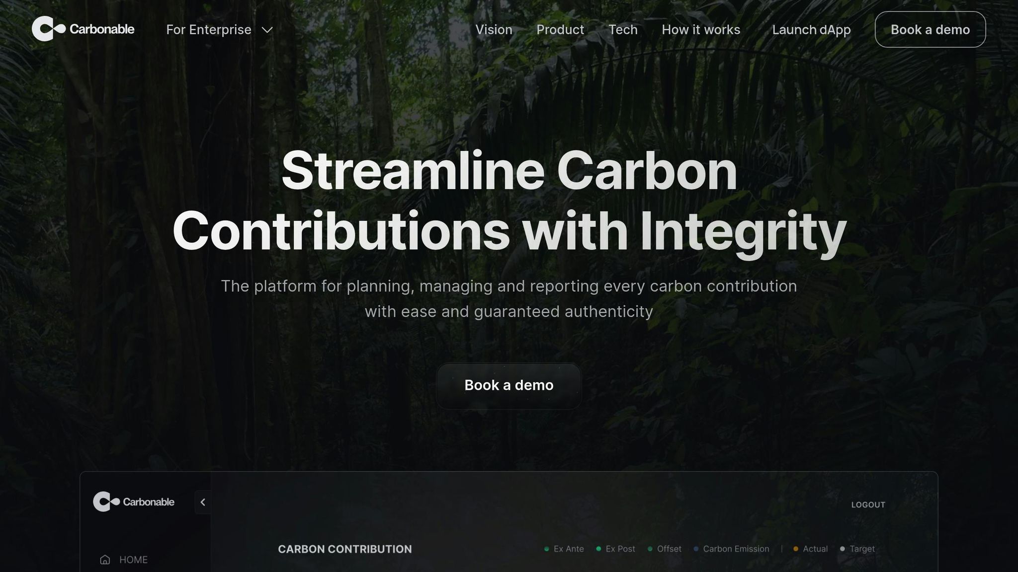
Carbonable demonstrates how Framer can transform environmental messaging into engaging and easy-to-understand narratives. The website highlights its mission to reshape carbon removal and carbon credit management, proving that organizations focused on sustainability can craft digital experiences that are both visually appealing and clear. It reflects a modern aesthetic while meeting the demand for responsive, user-friendly designs seen in other examples.
The site uses visual storytelling to simplify complex carbon credit concepts, breaking them into digestible, visually appealing sections. Instead of overwhelming visitors with technical jargon, the design ensures users can easily follow Carbonable's sustainability initiatives through intuitive navigation. This approach showcases how Framer seamlessly blends cutting-edge design with industry-specific messaging.
One standout feature is the transparent presentation of certified premium projects alongside its exclusive optimizer tool. This clear display not only builds trust but also shows how environmental companies can effectively use Framer to showcase their services in a professional and polished manner. Plus, the responsive design ensures the site looks and functions beautifully across desktops, tablets, and smartphones, maintaining its storytelling integrity.
4. Rosalia (Temlis Template): Minimalist Portfolio Masterclass
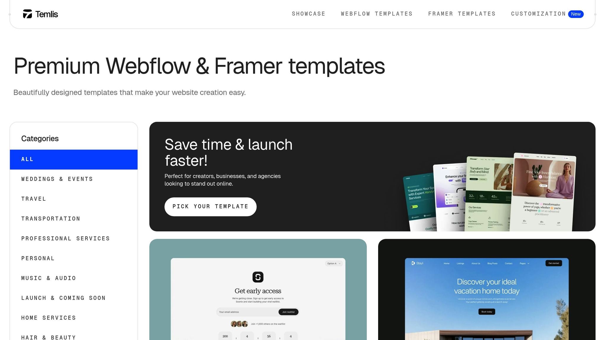
Rosalia is a $29 minimalist portfolio template built with Webflow, offering creative professionals a sleek and simple way to showcase their work. Its clean layout ensures that the spotlight stays on your projects, making it a perfect fit for photographers, designers, and artists.
What makes Rosalia stand out is its ability to cater to a variety of creative fields. Whether you're a graphic designer presenting brand identities, a photographer curating wedding galleries, or a UX designer sharing detailed case studies, this template adapts effortlessly to different content types while maintaining a cohesive look.
With Framer’s user-friendly customization tools, you can set up your portfolio quickly, even if you lack technical skills. The template focuses on smooth content integration, allowing you to skip the hassle of intricate design decisions and concentrate on your craft.
Rosalia is designed with responsive breakpoints, ensuring it looks great on smartphones, tablets, and desktops - crucial for the nearly 60% of users who browse on mobile devices. The layout automatically adjusts font sizes, spacing, and other elements to ensure readability and maintain its polished appearance across all screen sizes.
To add a touch of sophistication, Rosalia incorporates subtle animations that create smooth transitions between projects. These animations enhance user engagement without distracting from your work, striking a perfect balance between simplicity and functionality. It’s a template that sets a high bar for portfolio design in Framer.
5. Tella: Video Production Toolkit Demo
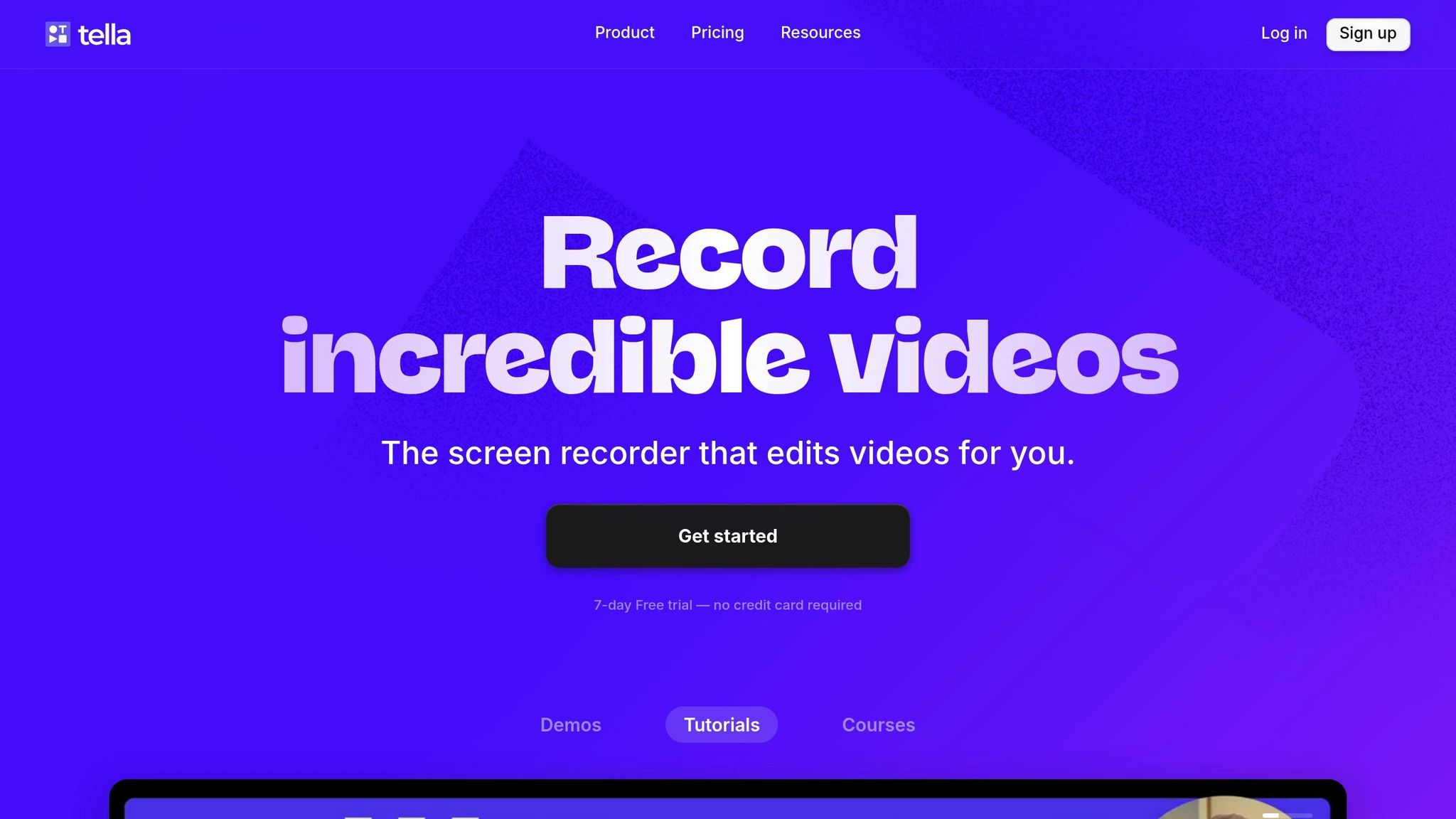
Tella takes video production up a notch with a user-friendly toolkit, staying true to the interactive and user-focused design principles we've seen in earlier examples.
The website demonstrates how Framer simplifies professional video creation for entrepreneurs and creators. Its layout emphasizes the main appeal: effortless screen recording combined with creative editing tools. Interactive demos allow visitors to experience the platform’s quality firsthand before diving into its features.
What makes Tella’s site stand out is its clip-based editing showcase. Instead of sticking to a traditional linear demo, the website features modular video segments that users can explore one by one. This approach mirrors Tella’s editing model, where users can record individual clips and arrange them sequentially, making corrections quicker and easier.
The platform’s responsive design works smoothly across its web app, Chrome extension, and Mac application. On mobile, the layout focuses on essential actions like starting recordings and accessing recent projects, ensuring a seamless experience on any device.
"Tella is a way better tool if you create content or share videos externally", says Alberto Di Risio.
Interactive elements on the site highlight standout features, such as punch-in effects for face zooming (introduced in October 2024) and AI-powered editing that automatically removes filler words and silences . These functionalities are presented clearly alongside a straightforward pricing structure.
The pricing is simple: Personal plans start at $19/month (or $15/month billed annually), while Team plans are $15 per user/month (or $12/month annually, with a minimum of three users) . This clarity makes it easy for potential customers to make a decision.
Tella’s website effectively combines technical features with an approachable design. Features like 4K exports, automatic captioning, and custom branding are illustrated with visual examples. The placement of calls-to-action encourages visitors to start their first video project, mirroring Tella’s in-app feature that lets users add clickable buttons to shared video pages.
User testimonials further reinforce Tella’s appeal. For instance, Zack Swire shares, “If you're a Coach or a Creator, and you'd like to create better videos quickly, check out @TellaHQ. I switched from Loom & I'm not looking back”. This blend of simplicity and professional-grade results makes Tella a compelling choice for content creators.
6. AnderDark (Temlis Template): Dark Mode Ecommerce
AnderDark brings a sleek, dark mode design to ecommerce, showing how a premium aesthetic can boost conversions. Its design strategy is carefully crafted, using dark backgrounds to highlight product visibility while delivering the modern, polished look that consumers today expect.
Instead of simply inverting colors, AnderDark employs dark gray shades that reduce eye strain while keeping everything clear and readable. This approach aligns with current trends, as 82.7% of Google's development team reportedly prefer dark mode for its eye comfort benefits.
What sets AnderDark apart is its mastery of visual hierarchy and product presentation. Dark backgrounds naturally make product images stand out, creating stronger contrast. This technique is often used in luxury retail. As Manuj Gosain of Levelshoes.com puts it:
"Dark UIs are dramatic, elegant, and complement luxury. A black background design reinforces striking visuals, introduces a sense of mystery, has better contrast, and supports visual hierarchy".
The template doesn't just stop at visuals - it integrates CMS and ecommerce tools like shopping carts, product galleries, and checkout systems, all designed with consistent styling and clear text-to-background contrast. This focus on contrast is essential, especially when cart abandonment rates average a staggering 70.19%.
AnderDark also shines in terms of performance, particularly for mobile users. Its design is optimized for dark mode on devices with OLED and AMOLED screens, where it can save between 39%-47% of battery life at full brightness. This added practicality makes it especially appealing for mobile shoppers.
The template goes beyond standard ecommerce by incorporating membership features for exclusive content, enabling businesses to create VIP experiences. This mirrors the strategy of Ounass, a luxury ecommerce platform by Al Tayer Group, which adopted dark mode in 2020 to enhance user experiences and build emotional connections with VIP customers across over 500 luxury brands.
Interactive features further elevate the user experience. Product hover effects, smooth transitions, and bold call-to-action buttons guide shoppers seamlessly through their journey. With dark mode becoming increasingly popular across platforms, AnderDark positions itself as a future-ready choice for ecommerce businesses.
Priced at $79, AnderDark delivers a complete dark mode solution that balances style and functionality. It’s a perfect fit for brands aiming to attract style-savvy consumers who value premium online shopping experiences. AnderDark proves that a well-executed dark theme can be both visually stunning and conversion-focused, making it a standout option for modern ecommerce.
sbb-itb-fdf3c56
7. Uroki Tattoo: Artistic Studio Presentation
Uroki Tattoo showcases how creative studios can use Framer's animation tools to craft a captivating digital experience. This tattoo studio's website breaks away from the typical gallery-style layout, opting for scroll animations and dynamic typography to highlight the artistry behind each tattoo.
One of the most striking features is a scroll-triggered, color-changing animation located just below the header. As visitors scroll through tattoo images, the text remains stationary while its color shifts in sync with the movement. This creates a visually stunning effect, echoing the transformative nature of tattoo art.
The website also excels in presenting artist profiles. Instead of static portfolio grids, Uroki uses reveal animations to introduce each artist's work. This approach gives every tattoo its moment in the spotlight, creating a gallery-like experience that celebrates the skill and creativity of the artists.
To enhance the visuals without overshadowing the tattoos, the site incorporates subtle blending modes. These understated effects add depth and texture, drawing attention to the artwork without being overpowering.
Typography plays a significant role in Uroki's design. The site uses Framer's typography tools to establish a clear visual hierarchy, making navigation effortless. Bold headings are paired with elegant script fonts, mirroring the balance between bold tattoo designs and intricate details. This careful attention to typography aligns perfectly with modern design aesthetics seen in other examples.
The inclusion of smooth scrolling effects ensures a seamless browsing experience, eliminating the abrupt transitions often found on image-heavy websites. These interactive elements work together to keep users engaged as they explore the site.
For creative studios aiming to build a strong digital presence, Uroki Tattoo demonstrates how innovative layouts and thoughtful details can set a website apart. This site not only showcases the studio's work but also communicates its artistic essence.
8. Imagen Pro (Temlis Template): Photographer's Gallery
Imagen Pro is a portfolio template tailored for photographers who want to tell stories through visuals. At $49, it offers a grid layout that emphasizes imagery, making it a great choice for showcasing creative work. Its focus on simplicity and visual impact defines its minimalist design.
The template uses a 12-column grid system, balancing structure with plenty of white space. This avoids the cluttered feel of some portfolio sites and keeps the spotlight on the photography itself.
What sets Imagen Pro apart is its performance-focused features. It includes lazy loading and image optimization, ensuring high-resolution images load quickly without compromising quality.
The responsive design ensures the site looks polished on any device, from desktops to smartphones. Smooth scrolling, subtle animations, and clean sans-serif typography enhance the overall experience, creating a modern, professional feel.
For photographers who need flexibility, Imagen Pro integrates with a CMS for easy management of albums and blogs. Customizable sections allow users to infuse their own artistic flair into the design.
The demand for templates like Imagen Pro is clear. Temlis photography templates have seen strong engagement, with the free "Photographer" template garnering over 47,500 views. This underscores the need for thoughtfully designed portfolio solutions.
.
This example highlights how Framer and templates like Imagen Pro can seamlessly combine aesthetics and performance. It’s a testament to how well these principles translate into real-world websites that deliver both creative impact and functionality.
9. Disco Dungeon: Gaming Narrative Interface

Disco Dungeon takes the idea of a gaming website to a whole new level by turning it into an interactive narrative experience, almost like playing the game itself. This turn-based puzzle RPG adventure site was named Site of the Month for June 2023, proving how Framer can bring storytelling and gaming to life in a way that grabs attention. Let’s dive into what makes this site stand out.
One of its most eye-catching features is the scroll interaction. As users navigate through the site, a character tags along, creating the feeling of exploring a dungeon in real time. This clever design merges marketing content with gameplay elements, making the whole experience feel seamless and engaging.
The homepage sets the tone with neon-lit visuals and lively animations that perfectly match the game's disco theme. Despite the bold graphics and animations, the site manages to keep navigation smooth and intuitive.
Performance is another area where Disco Dungeon shines. Even with its heavy use of videos and animations, the site loads quickly and runs without a hitch. The interactive storytelling pulls visitors into a narrative about recovering lost memories, while gameplay previews give a taste of the intuitive controls and mechanics.
This design approach is perfect for gaming audiences who crave interaction and involvement. By weaving a sense of agency into the website, it makes every user action feel meaningful.
Gamers will also appreciate the trailer showcase, clear breakdowns of gameplay mechanics, and an easy-to-use signup process. It’s designed to provide all the details players want before they dive into the game.
Disco Dungeon is a stellar example of how gaming websites can extend a game’s story and highlight its core features in a way that’s both fun and functional. It’s a glimpse into the future of creative gaming site design.
10. Melnūdens: Specialty Retail Micro-Interactions
Melnūdens Coffee shows how micro-interactions can elevate a simple retail site into a high-end shopping experience. This food and beverage landing page, crafted with Framer, uses subtle design touches to build an emotional connection with its audience.
The site’s split-screen desktop layout pairs coffee products with stunning visuals, creating a harmonious balance that reflects the precision and care behind coffee-making. This thoughtful design sets the stage for dynamic micro-interactions that further enhance the user experience.
Animations are subtle yet impactful, adding to the browsing experience without being intrusive. Hovering over product images or moving between sections triggers smooth transitions that maintain the site’s polished vibe while offering visual cues. These small interactions communicate a sense of exclusivity and sophistication, setting the brand apart from standard coffee retailers.
Typography plays a key role too. The Manrope font, with its clean, semi-condensed style, complements the brand's focus on craftsmanship. Paired with earthy tones, the sharp typography contributes to the site’s elegant and refined look.
Generous white space and crisp visuals draw attention to the coffee itself, highlighting the brand’s dedication to quality and craftsmanship. This minimalist approach, combined with natural tones, creates a modern yet timeless feel. It’s a design choice that resonates with customers seeking premium products and authentic experiences. The color palette and clear visual hierarchy guide users effortlessly through their shopping journey.
For specialty retailers aiming to create a high-end online presence, Melnūdens is a masterclass in how restraint in design can amplify impact. The site shows that well-thought-out micro-interactions don’t need to be flashy - they just need to align with the brand’s story.
Like other standout examples, Melnūdens uses Framer’s responsive design to ensure a seamless experience across all devices. This consistency reflects the brand’s meticulous attention to detail and its commitment to quality at every touchpoint.
Comparison Table
Here's a detailed breakdown of the design and functionality metrics for various Framer website examples, showcasing their distinct approaches:
| Website | Industry Focus | Main Design Feature | Animation Complexity | Mobile Performance |
|---|---|---|---|---|
| Donut Shop | Food Commerce | Interactive drag-and-drop menu that engages users | High – Engaging interactions | Excellent – Responsive design |
| Superhuman | SaaS / Productivity | Minimal, productivity-focused email design | Low – Minimal animations | Excellent – Mobile-first design |
| Carbonable | Environmental | Storytelling framework emphasizing eco-conscious messaging | Medium – Subtle animations | Good – Optimized for performance |
| Rosalia (Temlis Template) | Portfolio/Creative | Minimalist design with a strong typographic focus | Low – Subtle effects | Excellent – Multiple breakpoints |
| Tella | Video Production | Clean, video-focused interface | Medium – Engaging visual elements | Good – Streamlined mobile experience |
| AnderDark (Temlis Template) | E-commerce/Portfolio | Dark mode aesthetic with integrated CMS and e-commerce features | Medium – Smooth transitions | Excellent – Responsive layout |
| Uroki Tattoo | Creative Services | Artistic presentation enhanced by smooth scrolling effects | High – Dynamic scroll effects | Good – Optimized for visuals |
| Imagen Pro (Temlis Template) | Photography/Portfolio | Gallery-focused portfolio design | Low – Minimal transitions | Excellent – Photography-optimized |
| Disco Dungeon | Gaming/Entertainment | Interactive character navigation that guides users through a narrative | High – Game-like interactions | Good – Engaging mobile experience |
| Melnūdens | Specialty Retail | Visually appealing design with engaging micro-interactions | Medium – Subtle animations | Excellent – Premium mobile experience |
This table highlights how Framer adapts to various industries, balancing creative designs with functionality.
For instance, e-commerce and portfolio sites like AnderDark and Rosalia leverage multiple breakpoints to maintain seamless performance across devices. Animation complexity varies significantly: while Donut Shop and Disco Dungeon feature high-intensity interactions, portfolio examples like Rosalia and Imagen Pro keep it subtle and refined.
Framer's design choices align closely with industry needs. Superhuman prioritizes a clean, productivity-driven interface, while Uroki Tattoo uses bold visual storytelling to captivate its audience. Similarly, food and retail sites like Donut Shop and Melnūdens strike a balance between aesthetic appeal and commerce functionality.
On the mobile front, Framer excels with responsive designs, optimized visuals, and strategic breakpoints. This ensures smooth performance and a consistent user experience across a range of industries.
Conclusion
These examples showcase three key design patterns that boost engagement and performance. First, the use of animation plays a crucial role in enhancing user experience. High-interaction sites like Donut Shop and Disco Dungeon employ intricate animations to create memorable experiences, while portfolio sites such as Rosalia and Imagen Pro opt for subtle effects, allowing the content to take center stage. Second, responsive design stands out as a standard across all examples, with multiple breakpoints ensuring a smooth experience on any device.
Framer’s responsive capabilities power an impressive 81,353 live sites online, with each example demonstrating mobile-friendly performance. This range of solutions offers practical insights for improving your own projects.
Customization tailored to specific industries also proves critical. For instance, e-commerce sites like AnderDark integrate CMS and shopping features, while creative portfolios focus on clean, distraction-free layouts and visual storytelling. This versatility highlights Framer’s ability to adapt to different sectors.
To optimize performance, use appropriate font weights, select Google Fonts wisely, and keep blur effects minimal. For video content, platforms like YouTube or Vimeo are excellent choices, as they automatically adjust quality based on network speed and screen size.
Templates provide a strong starting point for any project. Options like Rosalia, AnderDark, and Imagen Pro illustrate how beginning with a well-designed template can speed up development while maintaining a professional finish. Instead of starting from scratch, tweaking proven designs saves time and ensures quality.
Real-time collaboration is another game-changer. Framer’s collaborative tools allow multiple stakeholders to work together seamlessly, shortening feedback cycles and making the platform accessible to teams with varying levels of technical expertise.
Ultimately, successful Framer websites strike a balance between aesthetics and performance. Whether you’re creating a food commerce site or a creative portfolio, prioritize responsiveness, fine-tune performance, and align interactions with your industry’s needs. Projects like Donut Shop and Rosalia exemplify how these practices lead to effective, professional web design.
FAQs
How does Framer make it easy to design interactive and responsive websites without coding?
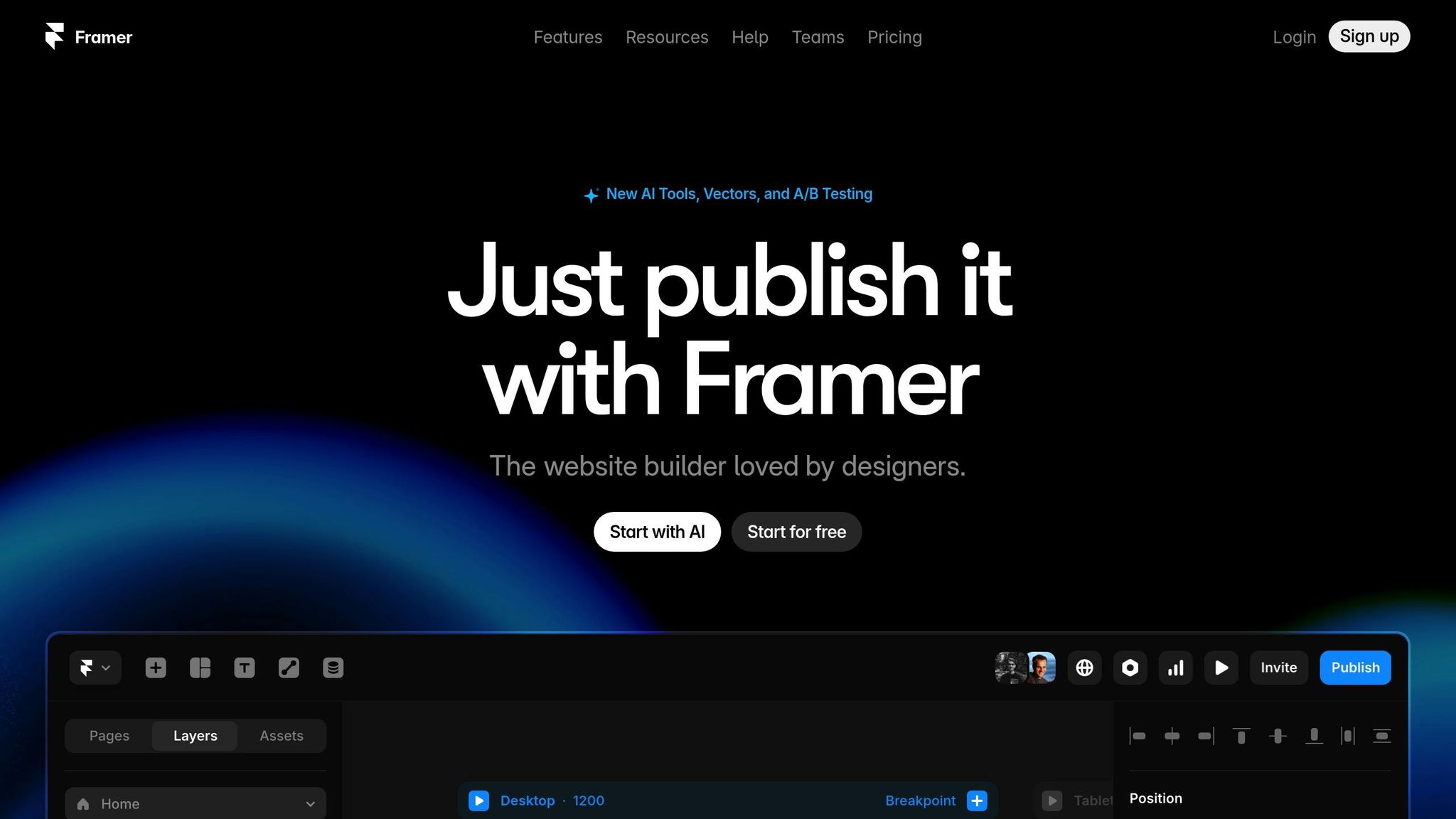
Framer makes building interactive, responsive websites a breeze with its no-code platform. Its user-friendly design tools give you an infinite canvas to work on, enabling you to create layouts that adjust seamlessly to various screen sizes. Adding animations or interactive elements? It’s as simple as a few clicks - no coding knowledge needed.
Thanks to its drag-and-drop interface, placing and customizing elements is effortless, whether you're an experienced designer or just starting out. This setup lets you channel your energy into creativity while ensuring your website is both functional and easy to navigate.
What makes Framer templates unique for different industries?
Framer templates are crafted to meet the unique demands of different industries, offering tailored features that help them shine. For tech companies and SaaS businesses, these templates often prioritize sleek, modern designs paired with interactive touches like animations and smooth transitions. Plus, they're fully responsive, ensuring they look and function flawlessly on any device - a must for keeping users engaged.
For creative professionals, agencies, and portfolio sites, Framer templates emphasize eye-catching layouts that focus on storytelling and showcasing brand identity. They’re highly customizable, giving users the freedom to align designs with their branding while maintaining a polished, cohesive appearance. This adaptability makes Framer a fantastic option for businesses aiming to establish a professional and memorable online presence.
How does Framer's responsive design make websites look great on any device?
Framer's responsive design tools make sure websites effortlessly adjust to various screen sizes, offering a smooth experience whether someone is browsing on a smartphone, tablet, or desktop. This approach ensures a consistent and visually pleasing interface, sparing users from unnecessary scrolling or zooming.
With user-friendly breakpoints and layout tools, designers can craft flexible and functional designs that shine on any platform. This not only enhances usability but also encourages visitors to stick around and explore your site further.
Related Blog Posts
Recommended posts