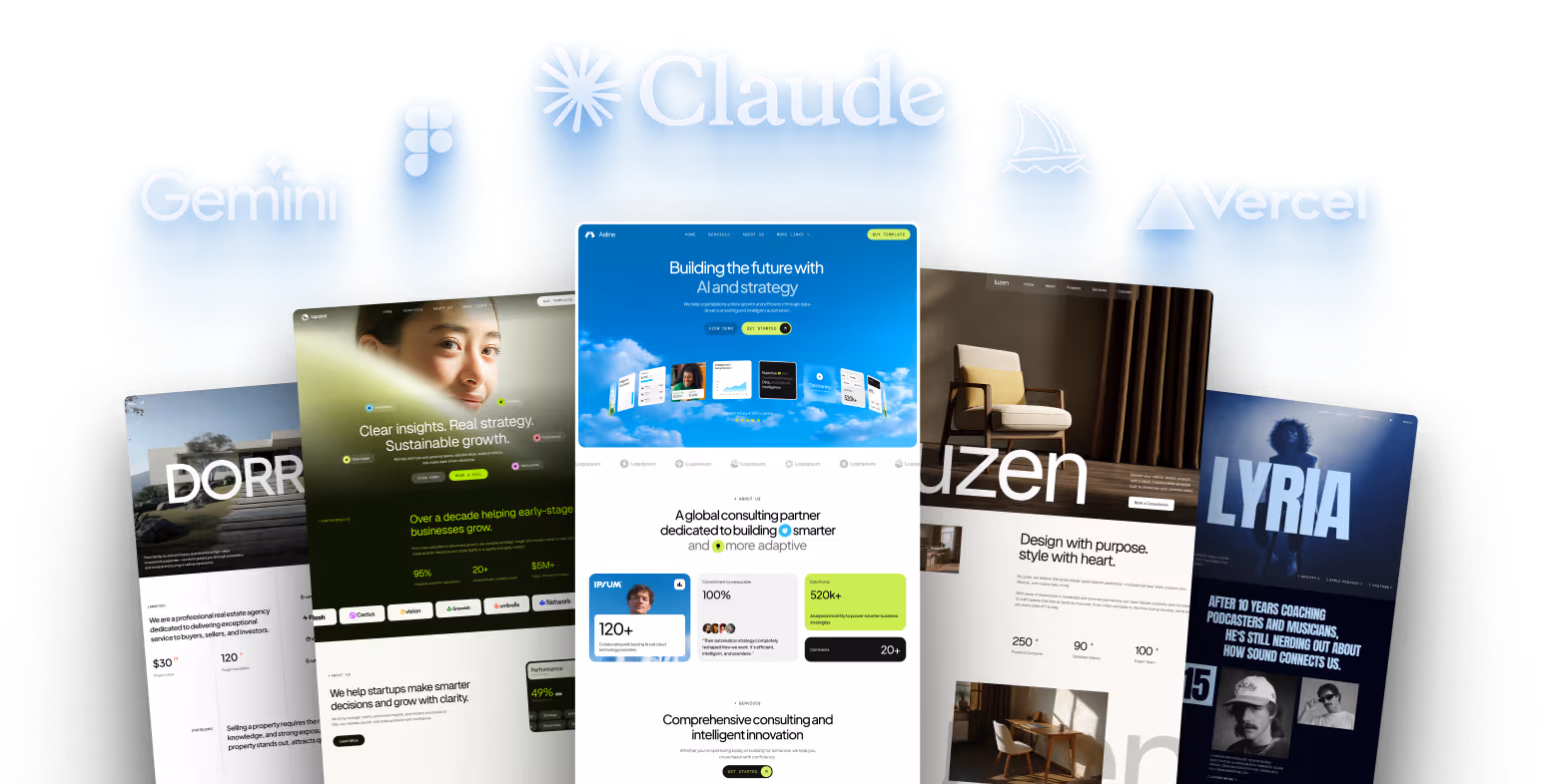
10 Webflow Website Examples for Inspiration

Webflow makes it easy to design stunning websites without coding. Here are 10 standout examples that showcase how Webflow can meet diverse needs across industries:
- Joseph Berry: A sleek, interactive portfolio with dynamic animations and minimalist design.
- Superlist: A productivity platform with modular layouts, smooth animations, and user-friendly navigation.
- Okalpha: An animation studio site with bold colors, 3D elements, and playful interactivity.
- UJET: An industrial design site featuring clean layouts, seamless scrolling, and product-focused visuals.
- Conservation Guide: An environmental marketplace with nature-inspired visuals and interactive maps.
- Rise Science: A health tech site using data visualizations and clear design to simplify sleep science.
- Meter: A network infrastructure platform with animations and straightforward explanations for complex services.
- Emma.ca: A life insurance platform with fast performance, multilingual features, and interactive tools.
- Temlis Advisora: A financial SaaS template designed for trust and professional presentation.
- Temlis Elevates: A real estate template with high-quality galleries, SEO optimization, and responsive design.
Each site balances visual appeal with functionality, tailored to its industry. Webflow’s tools allow for creativity and practicality, making it a top choice for businesses and designers alike.
10 Best Webflow Website Examples of 2025 – MIND BLOWING (!)

1. Interactive Portfolio Showcase: Joseph Berry
Joseph Berry’s portfolio isn’t just a website; it’s an experience. Recognized with Honorable Mention on Awwwards, Mobile Excellence, and the WOTD Award for Best UX, UI, and Innovation on CSSDA, this site elevates personal branding to a whole new level.
The journey begins with a minimalist splash page, centered around a bold yellow "Enter" button that immediately draws the eye. Clicking it sets off a seamless transition as the background slides open, revealing a world of carefully crafted microinteractions designed to guide visitors through Berry’s work.
Dynamic mouse interactions enhance the site’s interactivity, with the background responding to cursor movements and text subtly shifting to follow. Features like an animated play button and hover-triggered UI cards ensure clear calls to action, making navigation feel effortless.
Berry’s design choices are both deliberate and polished. A sleek color palette of black, off-white, and neutral tones keeps the focus on his work, while subtle touches - such as text changing color on hover and smooth section transitions - keep visitors engaged. The typography, paired with these effects, exudes sophistication and professionalism.
The portfolio is a testament to Berry’s versatility as a designer and Webflow expert. It seamlessly combines branding, art direction, UX/UI, interaction, and Webflow development into an intuitive and visually compelling showcase.
"Webflow has enabled me to step up the type of clients I'm getting, where I can really deliver on both halves. I can deliver really great design, but I can also deliver really great builds." – Joseph Berry, Founder, JB Studio LDN
Berry’s work proves that personal branding doesn’t need to be overcomplicated. Through smooth animations, thoughtful hover effects, and intuitive navigation, he creates a lasting impression that reflects his expertise and creativity.
2. Productivity Platform: Superlist

Superlist combines powerful productivity tools with a sleek, user-friendly design. Its website, which earned the prestigious Site of the Month award in April 2021, demonstrates how thoughtful web design can make even the most complex features feel approachable and easy to use. The site is crafted to guide users effortlessly through its offerings.
One of the key design elements is its modular layout, which uses bold color blocks to separate content into manageable sections. This clever use of contrast helps visitors quickly absorb information without wading through heavy text.
Navigation is kept straightforward with concise menus that make it easy for users - especially newcomers - to explore Superlist's features. The site emphasizes how seamlessly the platform integrates with existing workflows, making it an attractive option for teams and individuals alike.
A memorable feature of the site is its hero scroll animation, which shows a book opening. This creative touch serves as a metaphor for how Superlist helps users organize their lives more effectively.
On the technical side, the website uses advanced development techniques, including a canvas element with WebGL assets that respond dynamically to scrolling. Custom 3D visuals and interactive animations keep visitors engaged throughout their experience.
"Sweating the small stuff and really dialing in details such as micro-interactions is especially important on a single page site like Superlist – make every hover, tap or click count." - Nathan Riley, Design Director at GC
The typography further enhances usability. Clean, sans-serif fonts paired with strategic bolding and contrasting colors make the content easy to scan without overwhelming the reader.
The site also highlights Superlist's compatibility with team and project management tools, inviting users to explore its interactive features and see how it can fit into their workflow.
In 2024, Superlist released 27 product updates, showcasing its dedication to continuous improvement. The website reflects this focus, presenting its features in a way that's practical and user-centered rather than relying on flashy marketing.
3. Animation Studio: Okalpha

Okalpha demonstrates how animation studios can use Webflow to craft dynamic and visually engaging portfolios. Founded by Grant Campbell, the studio leverages its website as a platform to highlight its expertise in storyboarding, illustration, photography, and creative direction, presenting a cohesive and striking visual identity.
The site’s design revolves around a bold color palette of primary red, blue, and yellow. These colors don’t just grab attention - they create a memorable aesthetic that reinforces the studio's brand identity. This vibrant choice ensures that key elements stand out, leaving a lasting impression.
Interactive 3D elements are at the heart of the user experience. The website features animated 3D shapes that evoke the feel of Legos or a playful funhouse, reflecting the studio's creative and professional personality. Campbell incorporates extra-large typography paired with a parallax scrolling effect, which retracts geometric elements as users explore the page. This technique adds a sense of depth and creates more space for text. At the top of the site, an elongated 3D square dynamically zooms in and out, adding an extra layer of interactivity as visitors navigate .
Other interactive touches enhance the experience even further. For instance, buttons feature a 3D hover effect, tying back to Okalpha's animation expertise. The services section is designed to be clean and straightforward - clicking on any specialty opens a slide-in box with more details, keeping the content organized and accessible.
The site strikes a balance between playfulness and professionalism. Carefully designed animations guide visitors’ attention to key information, while the typography and layout ensure a smooth and intuitive browsing experience. Fonts are easy to read, and the layout is thoughtfully arranged to lead users through the site seamlessly. A 2D circle at the bottom of the page reveals contact details, providing a clear and simple way for potential clients to reach out .
Okalpha's website is a prime example of how animation studios can use their creative strengths to build Webflow sites that serve as both captivating showcases and practical business tools.
4. Industrial Design: UJET

UJET's website is a great example of how industrial design companies can use Webflow to craft digital experiences that align seamlessly with their physical products. The e-scooter maker’s site captures the sleek and modern style of their scooters while keeping the design clean and uncluttered, ensuring the e-scooters remain the center of attention. This careful balance extends to its strong technical capabilities.
The site was built by HookUX using Webflow's visual development tools and CMS, all within a $12,000 budget and a two-month timeline. Thanks to Webflow's no-code tools, the design team could implement advanced interactions without needing heavy programming.
Visitors are treated to smooth animations, seamless scrolling, and layered visuals that create depth without overwhelming the design. These interactive elements make exploring the site an engaging experience, showcasing detailed product features through high-quality images and in-depth case studies.
Performance was a top priority, meeting high standards for speed, accessibility, and SEO. The development team understood that industrial clients demand the same level of precision in their online presence as they do in their physical products.
"UJET is very easy to use and it allows the agent to answer quickly and have more than one way to interact with the customer." - Tanisha M., Small-Business
UJET's website demonstrates how industrial design companies can create digital experiences that match the sophistication of their physical offerings. By combining technical precision with engaging visuals, UJET successfully uses Webflow to bring their complex products to life online.
5. Environmental Marketplace: Conservation Guide

Conservation Guide takes Webflow's capabilities and applies them to the world of environmental conservation, creating a platform that connects users with meaningful opportunities in this space. Acting as a marketplace, the site helps users find and explore conservation programs and initiatives with ease.
The homepage makes an immediate impression with a full-width video background showcasing the beauty of nature. Paired with a prominent search bar, this design ensures visitors can intuitively search for opportunities. This approach aligns with best practices for environmental websites, using stunning visuals to highlight natural textures and landscapes .
One of Conservation Guide's standout features is how it uses Webflow's CMS to handle complex environmental data. The platform organizes maps, programs, and blog content through reusable custom content types. This structure allows for seamless connections between different content areas - for instance, linking specific conservation programs to geographic regions or tying blog posts to related initiatives . It's a smart way to present large amounts of information in a user-friendly manner.
The website also incorporates interactive design elements and smooth animations to enhance the browsing experience. These features make navigation engaging without being distracting. For conservation organizations, interactivity is key - platforms with features like interactive maps help users discover local conservation efforts and build stronger connections to their surroundings .
To maximize visibility, Conservation Guide takes advantage of Webflow's built-in SEO tools. The platform automatically updates sitemaps and allows for easy customization of meta tags. For organizations in the conservation space, these tools are essential for reaching audiences searching for sustainability-related content.
As Karol Polubinski explains:
"Webflow CMS exemplifies the evolution of modern content management - where technical sophistication meets operational simplicity. Organizations leveraging these capabilities create robust digital experiences that scale with business growth and market demands."
Conservation Guide strikes a balance between offering detailed information and maintaining user-friendly navigation. Visitors can quickly find programs, access resources, and even read stories about ongoing initiatives. By pairing educational content with actionable steps, the platform doesn't just inform - it inspires people to get involved .
6. Health Tech: Rise Science

Rise Science takes the complexities of sleep science and turns them into easy-to-understand, engaging experiences for users. Their Webflow-powered website features a clean layout, lively animations, and clear explanations of their sleep science and technology services. It's designed to help potential users quickly grasp how the company can help improve their sleep quality and energy levels.
The website employs a sleek dark theme, reflecting the company's mission to help users wake up ready for their "next best day." Bright, vibrant imagery paired with a minimalist design guides visitors through the site, encouraging them to explore and try the RISE app.
One of the most striking features is how the website presents scientific data. Interactive visualizations, like scrollable line graphs and bar charts, make complex sleep and energy data easy to digest. For instance, the "energy schedule" graph shows energy peaks and dips throughout the day, offering practical insights. These visual tools naturally lead users into more detailed educational content.
To deepen understanding, Rise Science includes a dedicated science page and a learning section filled with educational content. Custom illustrations further break down intricate topics, making the science behind their solutions accessible and engaging.
This combination of visual appeal and clear science has driven impressive results. According to metrics, 80% of users report noticeable benefits within just five days. The app has also garnered a stellar 4.6/5 rating from 45,141 reviews and was named one of Apple's Best Apps of 2024.
In January 2020, Rise Science partnered with Studio Godsey to improve user flows and the onboarding process. By refining the onboarding permissions and adding an interactive tutorial, they reduced the largest drop-off rate during onboarding to just 19% within four months.
The website and app also track sleep debt and energy patterns, offering users 16 science-backed habits, personalized recommendations, and a daily energy schedule tailored to their needs.
sbb-itb-fdf3c56
7. Network Infrastructure: Meter

Meter shows how a technical infrastructure company can turn complex networking solutions into a user-friendly web experience. Using Webflow, their website addresses one of the toughest hurdles in B2B tech: making intricate services clear and accessible.
The company simplifies its offering by acting as a one-stop shop for network infrastructure, handling setup and maintenance with a pricing model based on square footage of coverage. This straightforward approach is reflected in the site’s sleek and dynamic design.
What makes Meter’s website stand out is its clever use of animations and interactive elements on a long-scrolling homepage. These visuals don’t just look good - they help break down technical processes into bite-sized, easy-to-understand steps.
The site’s copy strikes a perfect balance, blending industry-specific language with plain explanations that cater to both IT professionals and business decision-makers. This clarity carries over to their presentation of the Command product.
The Command platform is a standout feature, combining dashboards with command-line interfaces. This design balances user-friendliness with the precision needed for infrastructure management. The website reflects this duality by presenting information in multiple formats - quick visuals for a high-level overview and detailed specs for those who need more depth.
Meter’s technical achievements add credibility. Their models reduce errors by more than 2.5× compared to other advanced models, while Command cuts latency by 2–3×, and in some cases, up to 10×.
The website is a masterclass in clean, intuitive design, guiding visitors through layers of information at their own pace. Whether someone is skimming for a quick answer or diving deep into the details, the site makes it easy to find what they need.
For technical industries, Meter’s approach is a powerful example of how to present sophisticated services effectively. Their success lies in respecting their audience’s intelligence, offering clarity without oversimplifying complex concepts.
8. Insurance Platform: Emma.ca

Emma.ca uses Webflow to create a trustworthy and seamless life insurance experience in the highly regulated insurance industry. This Canadian platform proves that even in such a strict field, you can deliver a professional yet engaging user experience.
The company caters to young families with a simple 3-step process: survey, needs calculation, and online application. What’s typically a long and intimidating process becomes straightforward and easy to navigate.
One standout feature of Emma.ca is how it uses Webflow's CMS tools to connect with its audience. For example, the site includes a baby name database built within the CMS, a clever way to attract search engine traffic from new and expecting moms - one of their key demographics. This strategy not only boosts organic traffic but also provides meaningful content for its users.
Another notable aspect is the platform's multilingual functionality. By offering both English and French versions, Emma.ca reaches a larger audience across Canada. Their team uses the CMS to craft content that speaks directly to their customers, all while ensuring the site performs exceptionally well.
Despite being packed with content, Emma.ca maintains fast load times and is fully responsive. The site incorporates interactive elements, such as videos on the homepage, without sacrificing performance. For an insurance platform, this balance is critical - users need access to detailed information without the frustration of slow-loading pages.
Emma Life Insurance has earned a 5.0 rating on Trustpilot from 1,367 reviews. Customers frequently praise the platform for its quick and hassle-free application process.
"Get the fastest life insurance in Canada. No medical exam. It's simple, safe and affordable with Emma. Protect your loved ones now."
- Emma.ca
Emma.ca demonstrates how thoughtful design and clear processes can foster trust without overwhelming users. Its success highlights how Webflow enables financial service companies to prioritize user experience while maintaining the professionalism and security their customers need.
9. Financial SaaS: Temlis Advisora

The Temlis Advisora template is a standout example of how financial SaaS companies can establish trust and showcase their expertise. Released on February 13, 2025, and priced at $129, this template is crafted specifically for accountants, financial advisors, and SaaS businesses aiming to create a polished online presence.
What makes Advisora shine is its thoughtful design tailored to the financial sector. It includes more than 12 pages and over 25 sections, offering features like detailed service descriptions, client testimonial areas, and resource libraries. These elements make it easier for businesses to highlight their expertise effectively.
The template's modern, professional design ensures it meets the high standards expected in financial services. With its clean and polished layout, it’s perfect for showcasing budgeting tools, financial management services, and SaaS offerings. Its flexible multi-layout format also helps build the trust that’s crucial for financial platforms.
Advisora goes beyond aesthetics with features that enhance functionality. It includes interactive pricing tables, advanced data visualizations, and integrated charts, allowing companies to present financial insights and subscription plans clearly and effectively.
Built using Webflow, the template is 100% responsive and offers customizable sections, an intuitive CMS, SEO optimization, and fast loading speeds. Subtle animations add a touch of interactivity without detracting from its professional tone.
For added versatility, Advisora provides multiple homepage variations and dedicated pages for About Us, Contact, Features, Pricing, and Blogs. A fully editable Figma file is included, making customization straightforward. This allows financial SaaS companies to adapt the template to their unique needs, whether for showcasing products or emphasizing subscription models, all while maintaining a cohesive brand identity.
Up next, we’ll explore how real estate platforms adopt similar design strategies.
10. Real Estate: Temlis Elevates

Temlis Elevates is a real estate website template designed for property professionals who understand the importance of aligning with modern buying habits. With 95% of home buyers researching properties online and 63% making offers without ever stepping foot on-site, a strong online presence is no longer optional - it's essential.
At a price of $79, Elevates offers a sleek, polished design that radiates professionalism, a key element when clients are making significant financial decisions.
What sets Elevates apart is its versatile, multi-page layout that works seamlessly for luxury properties, architectural portfolios, or real estate developments. It comes with pre-designed pages like Home, Projects, Services, About Us, Blogs, and Contact, giving you a solid starting point for building a complete real estate website.
The template includes features that matter most to real estate buyers: high-quality photo galleries, client testimonials, and team bios to establish trust. Interactive animations enhance the browsing experience, while its fully responsive design ensures your listings look stunning on any device, whether it's a smartphone, tablet, or desktop.
From a technical perspective, Elevates is built to perform. It’s SEO-optimized to help your properties rank in search results and designed for fast loading speeds, ensuring potential buyers stick around. For those who want to make the design their own, the template comes with a fully editable Figma file, so you can adjust every detail to reflect your brand. Global color swatches make it easy to maintain consistent branding across the site.
Temlis Elevates strikes a perfect balance between visually engaging design and practical business tools, helping you capture the attention of potential clients from the moment they visit your site.
Comparison Table
Here’s a breakdown of how various Webflow websites align their design choices with the unique needs of their industries. This table connects each site's visual and functional elements with broader industry expectations, showcasing Webflow's ability to adapt to different demands.
| Website | Industry | Key Design Highlights | Primary Functions | Standout Features |
|---|---|---|---|---|
| Joseph Berry | Creative Portfolio | Interactive animations with mouse-responsive text and images, neutral color scheme | Portfolio showcase, personal branding | Color-changing text links on mouseover, dynamic background interactions |
| Superlist | Productivity SaaS | Clean interface with smooth animations and visually appealing design | Task management demonstration, team collaboration | Integration previews with other software, intuitive navigation |
| Okalpha | Animation Studio | Bold, bright colors (red, blue, yellow) that emphasize key elements | Creative portfolio, service demonstration | Storyboarding and illustration showcase, memorable use of vibrant colors |
| UJET | Industrial Design | Clean layout with smooth animations, thoughtful layering, and seamless scrolling | Product showcase, brand positioning | Design elements that reflect product quality |
| Conservation Guide | Environmental Market | Nature-inspired visuals, full-width video backgrounds, and detailed project content | Educational content, project showcases | Interactive design elements and captivating imagery |
| Meter | Network Infrastructure | Long-scroll homepage featuring animations and detailed copy | Visual service explanation, technical communication | Animation-driven storytelling simplifying complex concepts |
| Emma.ca | Parenting Resource | Multiple video integrations with fast-loading performance for a content-heavy site | Interactive engagement, baby name exploration | Webflow CMS-powered baby name database, mobile-friendly design |
| Temlis Advisora | Financial SaaS | Professional design that conveys trust and financial expertise | Financial service showcase, client acquisition | Industry-specific functionality and credibility-focused design |
| Temlis Elevates | Real Estate | High-quality photo galleries, client testimonials, team bios, and interactive animations | Property showcase, professional credibility | Multi-page versatility, SEO optimization, and responsive design |
These examples highlight Webflow's ability to cater to both visually stunning and highly functional websites. For instance, creative portfolios like Joseph Berry and Okalpha emphasize bold visuals and interactive features, while platforms like Superlist and Meter focus on clean layouts and purposeful animations to deliver functionality. Meanwhile, content-heavy sites such as Conservation Guide and Emma.ca demonstrate how rich media can coexist with optimized performance.
Across all these designs, the common thread is a focus on user experience. Whether through engaging animations, mobile optimization, or industry-specific features, each site uses thoughtful design to enhance usability and meet industry standards. This variety underscores Webflow's ability to support everything from visually impactful portfolios to efficient, user-friendly technical platforms.
Conclusion
These examples showcase just how versatile Webflow can be - from interactive, mouse-responsive portfolios to long-scroll technical narratives - each designed to enhance the user experience. With over 3.5 million designers and teams already leveraging the platform, these examples are just a glimpse of what’s achievable.
From bold creative portfolios to polished financial platforms, these designs highlight a shared principle: great design aligns with specific business goals. What ties them together is Webflow’s ability to deliver both visual appeal and functionality, all without requiring extensive coding. These examples demonstrate how thoughtful design choices can directly support business outcomes.
Take Conservation Guide, for instance. Its nature-inspired visuals perfectly align with its mission, while Emma.ca’s video integrations and CMS-powered baby name database cater directly to new parents. Each site takes full advantage of Webflow’s drag-and-drop tools and customization features, creating experiences that feel tailor-made for their industries.
The key takeaway? Effective design is a balance of creativity and functionality. UJET’s clean layout and smooth animations mirror their product’s quality, while Superlist’s interface uses design to showcase its productivity tools. These aren’t just aesthetic decisions - they’re purposeful strategies made possible by Webflow’s real-time visual editing, empowering designers of all experience levels.
FAQs
How does Webflow improve user experience across different industries, as shown in these examples?
Webflow transforms how websites are built by offering tools that allow users to create stunning, interactive designs without needing to dive deep into coding. With its visual editor, responsive design capabilities, and built-in content management system, designers can craft layouts that are both functional and visually impressive.
The platform's dynamic animations and custom interactions add an extra layer of engagement, making websites feel more interactive and intuitive to explore. Plus, Webflow prioritizes mobile responsiveness and includes SEO-friendly features to ensure websites perform well on any device. This blend of design flexibility and performance-focused tools makes it an excellent choice for building tailored web experiences across different industries.
What makes Webflow a great tool for designing creative websites without coding?
Webflow shines as a platform that empowers users to create professional websites without touching a single line of code. With its drag-and-drop interface, you can visually design and tweak layouts, fonts, and animations directly on the screen. This hands-on approach makes the design process straightforward while still offering plenty of room for creativity.
What sets Webflow apart is its built-in CMS (Content Management System) and e-commerce capabilities. Whether you're managing dynamic content or setting up an online store, the platform simplifies these tasks, making them approachable even for those without technical expertise. This blend of creative freedom and practical tools makes Webflow a go-to solution for both beginners and experienced designers.
How do the featured websites use Webflow's tools to combine stunning design with seamless functionality?
Websites built with Webflow harness its robust tools to achieve a seamless blend of stunning visuals and reliable performance. Using Webflow's visual editor, designers can create responsive layouts that adjust effortlessly to various screen sizes, delivering a consistent and intuitive experience on any device.
On top of that, Webflow's CMS (Content Management System) simplifies the process of managing and updating dynamic content while preserving the site's design integrity. This mix of adaptability and precision ensures these websites remain visually striking, easy to navigate, and practical. Together, these features empower the creation of websites that are not only functional but also aesthetically captivating.
Related posts
Recommended posts
Deliver more, charge more.