
How to Customize a Website Template: Step-by-Step Guide
Unlock all templates


Want to create a website that stands out? Customizing a website template can help you build a unique online presence without starting from scratch. Here's a quick guide to getting started:
- Pick the Right Template: Choose one that matches your industry (e.g., tech, fitness, finance) and needs (e.g., mobile-friendly, fast loading, CMS support).
- Set Up Tools: Use platforms like Webflow or Framer for easy customization. Install necessary tools and create backups before making changes.
- Design Your Brand: Update colors, fonts, and visuals to reflect your brand identity. Stick to simple rules like the 60-30-10 color scheme for balance.
- Optimize Layout: Ensure your site is responsive, organized, and easy to navigate across devices.
- Add Features: Include forms, buttons, and animations to make your site interactive and user-friendly.
- Test and Launch: Check performance, fix issues, and ensure your site works seamlessly on all devices before publishing.
Quick Tip: A fast-loading website can triple your conversion rates. Use tools like Google PageSpeed Insights to optimize performance.
Follow these steps to create a professional, engaging website that leaves a lasting impression.
Framer Basics For Customizing Templates

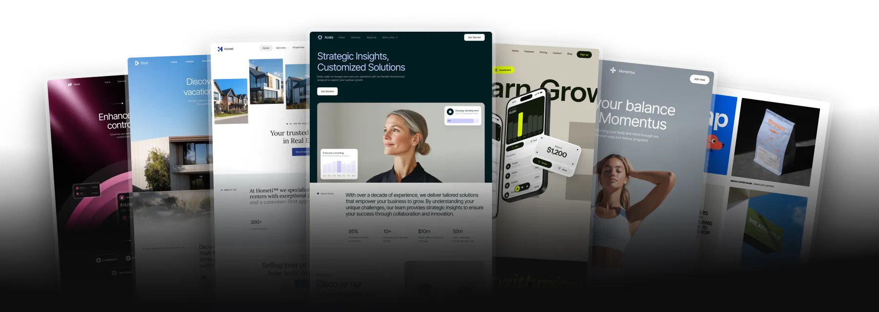
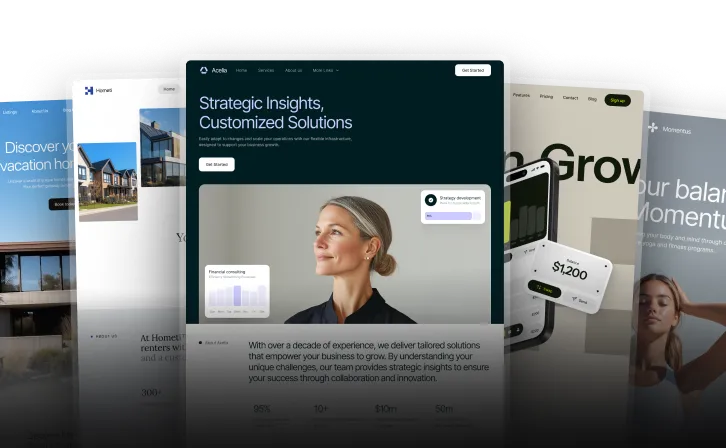
Select a Website Template
Picking the right website template is the first step to creating a site that fits your brand and offers a smooth experience for your visitors.
Define Website Requirements
Start by outlining what your website needs. Here are some key areas to focus on:
| Feature Category | Key Considerations |
|---|---|
| Layout Structure | Homepage design, navigation style, content sections |
| Technical Needs | CMS compatibility, e-commerce options, form builders |
| Mobile Display | Responsive design, mobile-friendly menus, touch interactions |
| Performance | Fast loading times, animation options, SEO-friendly setup |
Browse Templates by Industry
Look for templates tailored to your industry. Prices range from free to $129. Here are some examples:
- SaaS & Technology: Templates like Miros ($129) and Darken ($79) are great for showcasing software and tech services.
- Financial Services: Moneta ($79) and Advisora ($129) are designed to highlight financial offerings.
- Wellness & Fitness: Harmoni and Serenium (both $79) are ideal for businesses focused on health and wellness.
Check Template Features
Before committing to a template, review its features to ensure it meets your needs:
- Content Management Systems: Look for templates with built-in CMS for easier content updates.
- Design Flexibility: Check if the template allows you to adjust colors, fonts, and layouts.
- Mobile Responsiveness: Make sure the design works well on all devices. For instance, MoveFitness ($49) is a responsive option perfect for fitness businesses showcasing videos and client testimonials.
Think about what your site needs now and what it might need later. Templates like Vetic ($129), created for veterinary and pet care services, offer room to grow. Once you've chosen your template, you're ready to start customizing!
Set Up for Customization
Follow these steps to prepare for customization.
Install Design Tools
Start by installing the necessary design tools. For Webflow users, ensure you meet these requirements:
| Requirement | Specification |
|---|---|
| Browser Resolution | At least 1,268px width |
| Compatible Browsers | Latest versions of Chrome, Firefox, Safari |
| Internet Connection | Stable broadband connection |
| Account Access | Webflow Dashboard credentials |
If you're using Framer, download and install the desktop application to access its full suite of design tools.
Learn Template Layout
Understanding how your template is structured is key to making effective changes. Templates typically have three main areas:
- Header Area: Contains navigation, logos, and key calls-to-action.
- Content Area: Includes the main sections and page content.
- Footer Area: Features contact info and secondary navigation links.
Use the List View feature to review the template's components. Pay close attention to locked elements, as these are essential structural pieces that shouldn't be altered. Take time to explore how each section interacts with the others.
Create Template Backup
Before making any changes, create backups to avoid losing your work:
-
Local Backup
Organize your files in a clear folder structure:website-backup/ ├── template-original/ ├── assets/ └── custom-code/ -
Cloud Storage
Save an extra copy in a cloud storage service for added security. -
Version Control
Use a clear naming convention for versions, like:
template-v1-03062025-original
template-v2-03062025-color-updates
"...redundancy is the duplication of critical components or functions of a system with the intention of increasing reliability of the system, usually in the form of a backup or fail-safe...." - Wikipedia
With your tools installed and backups in place, you're ready to start customizing your design elements.
sbb-itb-fdf3c56
Change Design Elements
Make your template align with your brand's style and identity.
Update Colors and Fonts
Start by creating a color scheme that reflects your brand. In Webflow, you can use global swatches to ensure your colors are consistent throughout your site and easy to update later.
For balanced color distribution, stick to the 60-30-10 rule:
| Color Type | Usage Percentage | Application |
|---|---|---|
| Primary Color | 60% | Main backgrounds, large sections |
| Secondary Color | 30% | Supporting elements, headers |
| Accent Color | 10% | Call-to-action buttons, highlights |
Keep your fonts simple - limit them to two typefaces for a clean, cohesive look. When uploading custom fonts, use the .woff2 format for better performance. Pay attention to font hierarchy to guide users effectively:
- Headlines: Use bold, eye-catching fonts (20–32px).
- Body Text: Choose easy-to-read sizes (16–18px).
- Supporting Text: Slightly smaller sizes work best (14–16px).
Once your colors and fonts are set, move on to adding custom visuals to elevate your design.
Add Custom Images
Images should look great without slowing down your site. Follow these size and file guidelines for optimal results:
| Image Type | Recommended Size | Maximum File Size |
|---|---|---|
| Hero Images | 1,500–2,500px wide | 500 KB |
| Product Photos | 1,000–1,500px wide | 300 KB |
| Thumbnails | 300–500px wide | 100 KB |
Keep your total page size under 2 MB to ensure fast load times. Use JPEG for photos and PNG for logos or graphics with transparency.
Once your visuals are in place, fine-tune your layout for smooth navigation.
Adjust Page Layout
Use Webflow Sections or Framer stacks to create a clean, organized layout. Keep these key principles in mind:
-
Content Organization
Arrange your content with a clear visual hierarchy. Webflow's Pages panel can help you structure sections and maintain proper URL paths. -
Spacing Consistency
Maintain even spacing between elements to create a visually pleasing rhythm. Framer's stack properties make it easy to keep gaps consistent. -
Responsive Behavior
Test your layout on different devices. In Framer, use fixed, relative, fill, or fit content settings to ensure your design adapts seamlessly.
These adjustments will help your site look polished and professional across all devices.
Add Features and Interactions
Turn your template into a dynamic, engaging experience by incorporating interactive elements that improve navigation and usability.
Set Up Navigation
A well-structured navigation system helps visitors find what they need quickly. Research shows that improving website UX can increase key performance metrics by up to 83%.
Here are some navigation tips:
| Navigation Element | Purpose | Best Practice |
|---|---|---|
| Main Menu | Primary site sections | Limit to 5–7 items |
| Dropdown Menus | Subcategories | Avoid more than 2 levels |
| Mobile Menu | Touch-friendly access | Use tap targets of at least 48×48px |
| Search Bar | Quick content access | Place prominently, especially on mobile |
For longer pages, consider using sticky navigation so users can access the menu as they scroll. Keep menu labels clear and descriptive to ensure users know exactly where they’re going.
Next, focus on creating effective forms and buttons to encourage user actions.
Build Forms and Buttons
Well-designed forms and buttons are key to driving conversions. Make them intuitive and easy to use so visitors can complete actions without frustration.
Here’s a simple guide for button design:
| Button Type | Usage | Visual Style |
|---|---|---|
| Primary | Main actions (e.g., Submit, Buy) | Bold colors, larger size |
| Secondary | Alternative actions (e.g., Cancel) | Softer colors, medium size |
| Tertiary | Optional links (e.g., Learn More) | Text-style, minimal styling |
Improve engagement with small but noticeable visual cues like:
- Color changes when hovering over buttons
- Subtle animations when clicked
- Loading indicators during form submissions
- Success messages after completing forms
Now, let’s add motion effects to bring your site to life.
Include Motion Effects
Animations can make your site more interactive and visually appealing. Tools like Webflow let you create advanced motion effects without needing to code.
Focus on these animation types:
| Animation Type | Use Case | Performance Impact |
|---|---|---|
| Fade transitions | Smoothly reveal elements | Low |
| Scroll animations | Highlight content as users scroll | Medium |
| Hover effects | Make interactive elements stand out | Low |
| Loading states | Show feedback for user actions | Medium |
Stick to CSS for simple effects like fades and transitions, and reserve JavaScript for more complex animations. Always test these effects on various devices to ensure smooth performance.
Review and Launch Website
Before launching your website, it's crucial to test and fine-tune it for top-tier performance. Did you know that a B2B site loading in just one second can achieve three times higher conversion rates compared to one that takes five seconds?.
Test on Multiple Devices
With mobile devices accounting for 59% of global web traffic, testing across desktops, tablets, and mobile phones is a must. A thorough review ensures your design works seamlessly on all screen sizes.
| Device Type | Testing Focus | Key Checks |
|---|---|---|
| Desktop | Large Screens | Layout, image quality, navigation |
| Tablet | Medium Screens | Touch interactions, orientation |
| Mobile | Small Screens | Loading speed, tap functionality |
Improve Site Performance
Site speed plays a major role in user experience and search engine rankings. Here are key ways to make your site faster:
| Optimization Area | Action | Impact |
|---|---|---|
| Images | Convert to WebP format | Reduces size by 26% compared to PNG |
| Code | Enable Gzip compression | Cuts file size by 70% |
| Resources | Activate caching | Speeds up repeat visits |
| Scripts | Move to page bottom | Avoids render-blocking issues |
"HTTP/2 adoption across the board - huge improvements for everyone."
– Jeff Atwood, co-founder of Stack Exchange and Discourse
To identify areas for improvement, tools like Google PageSpeed Insights and GTmetrix are invaluable. With mobile data usage expected to triple between 2023 and 2029, optimizing performance is more important than ever. Once you've resolved any bottlenecks, finalize your technical and content settings.
Publish Website
With your design and performance dialed in, it's time to prepare for launch. Double-check everything to ensure smooth functionality before going live.
-
Technical Verification
Test your site on various networks, including 5G, 4G, 3G, and Wi-Fi. Check all interactive elements for proper functionality. -
Content Review
Confirm that all links, images, and error pages are working. Ensure content displays properly across devices. Keep in mind that Android dominates with a 70.1% market share, while iOS holds 29.2%. -
Performance Validation
Monitor your site's performance using analytics tools. Consider adding a Content Delivery Network (CDN), which now handles 70% of global internet traffic, to improve loading speeds worldwide.
"Responsive design gives your website the flexibility to attractively display content regardless of device size."
– Media Genesis
With everything checked and optimized, your site will be ready to make a strong impression from day one.
Conclusion
Webflow and Framer make customizing website templates much easier. With the steps outlined earlier, these platforms combine advanced features with easy-to-use interfaces.
Choosing the right template is key. Look for templates designed specifically for your industry, as they often include features tailored to your business needs.
Your choice of platform will shape how efficiently and uniquely your website comes together. Whether you're building a portfolio, an online store, or a business site, the goal is to balance streamlined customization with branding to create a strong, effective online presence.
Related Blog Posts
Recommended posts
Unlock all templates